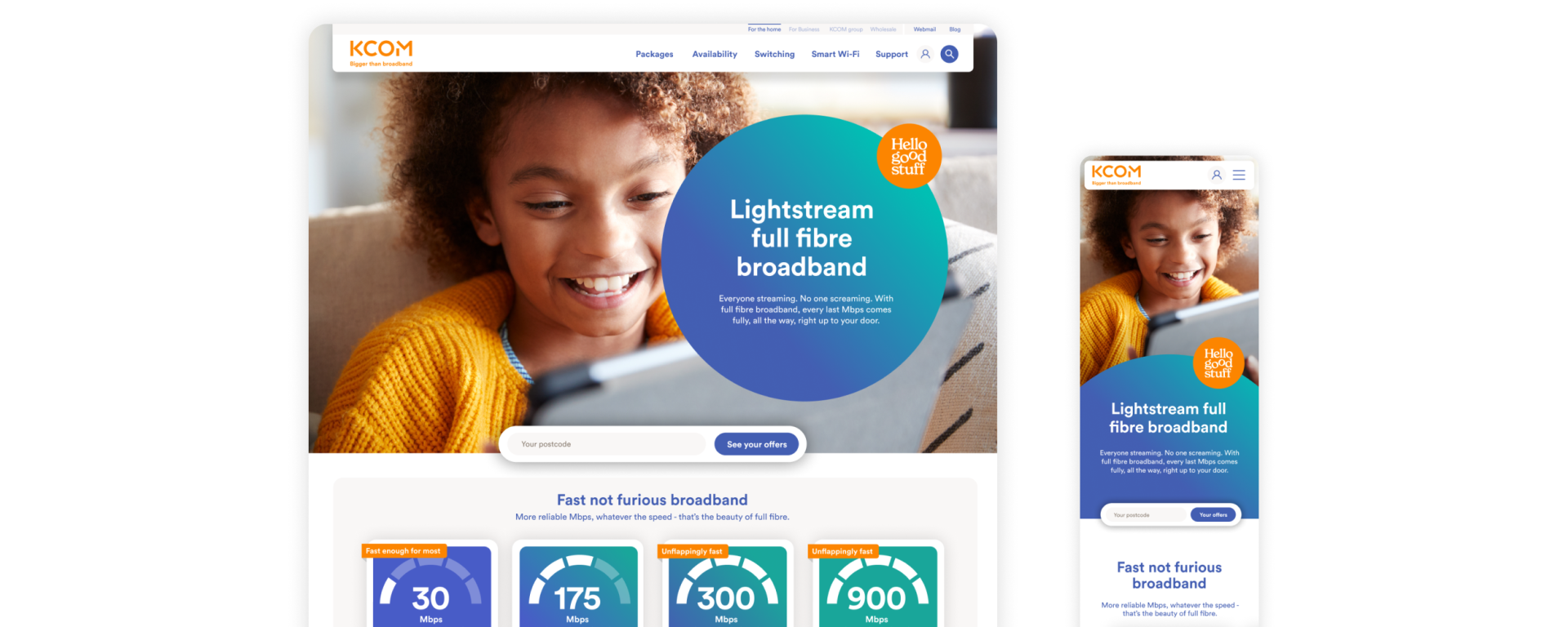
Broadband provider KCOM were expanding outside of their heartland in Hull. This meant competing with the likes of Virgin and BT.
While there were lots of reasons for the audience to pay attention to KCOM, they wanted to make sure their users weren’t just visitors, but buyers too. To improve their conversions, KCOM needed to get a better handle on how users interacted with their site, and better tailor the experience to them.
Better Insights
Through our Ponderation process, we understood that: KCOM offered full-fibre broadband that was faster and more reliable than larger providers, their broadband had a notable impact on people’s quality of life and online broadband purchasing was typically a confusing and complex process.

Audit Process
We decided to undertake an in-depth UX audit to get some real data behind any future design decisions on the site, and make sure we stayed as user-centred as possible.
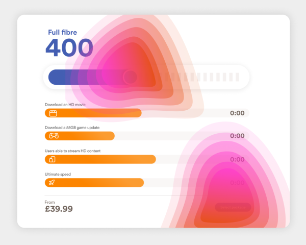
Using our full audit toolkit, as well as sales funnel data provided by KCOM, we knew we’d be able to understand why KCOM website users weren’t engaging enough, and how to rectify this.
Better Ideas
Following the audit’s positive outcomes, we felt much more confident in how to approach the user journeys of the site, making the next stage (a new, UX-driven design look and feel for the site) much easier to complete with this extra guidance.
Since taking the time to complete the audit, the new designs have scored extremely high on user tests, thanks in no small part to our diligent research throughout the audit.
Better Results
Client Feedback
“Ponderosa interpreted all asks perfectly – delivering the right balance of data analysis and evaluation based on previous experience, along with practical and creative ideas for implementation. I’m so pleased with the output – it’s by far the best web audit output I’ve received”.
KCOM Client Feedback
Got a similar project for us?
Our super-friendly team will be happy to chat through our experience and give expert advice.